We recommend avoiding use of disabled elements. Disabled elements cannot be navigated to or interacted with, making them inaccessible to users who rely on assistive technology. User research and feedback has also validated this recommended approach.
Instead, we recommend:
- Showing the content/element as enabled and interactive.
- Hiding the content/element but including information explaining their limited access.
- Hiding the content/element entirely with no extra explanation.
Permissions
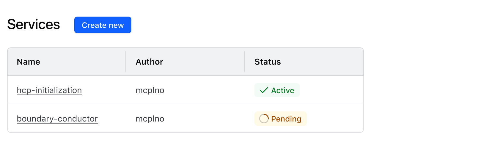
When a user does not have permissions, hide the related actions, navigation items, and views.
Hide/show relevant UI
In this example, the user's role is viewer, and they cannot deploy or destroy a cluster. An explanation is unnecessary as users do not require additional functionality for their day-to-day tasks.
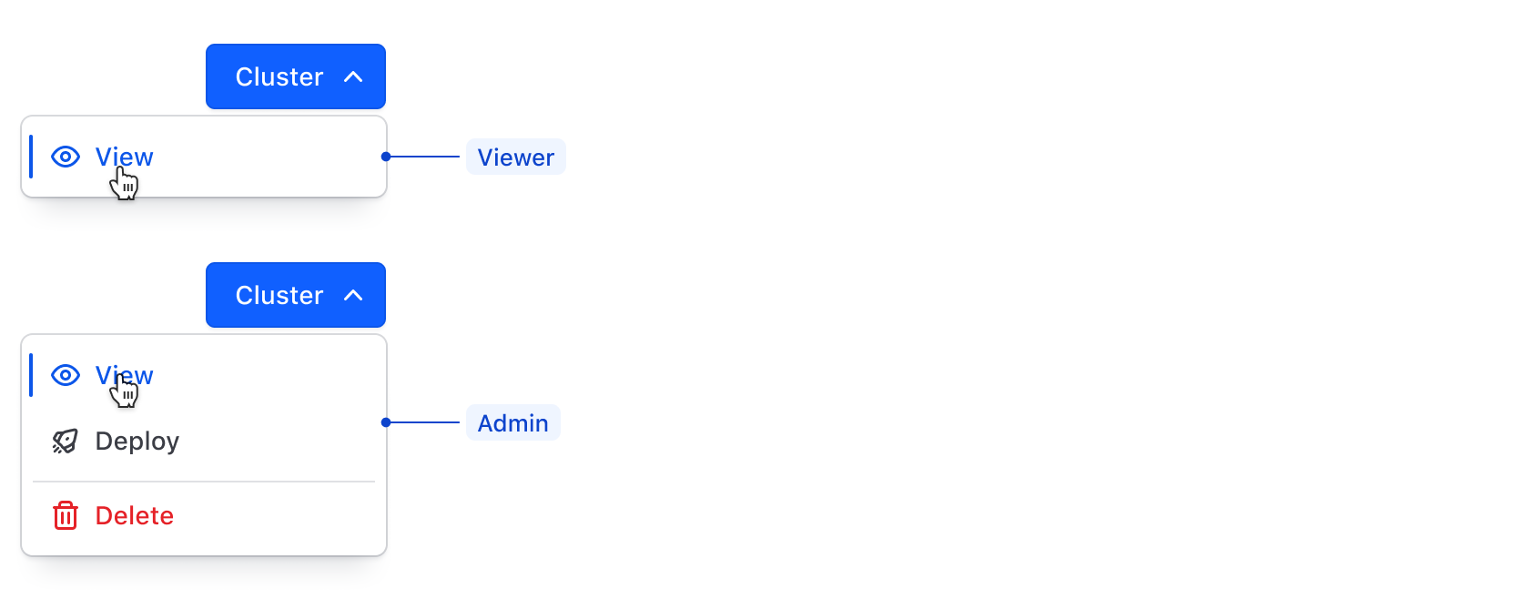
Similarly, if a user has the permissions to update, show the relevant UI allowing them to do just that.
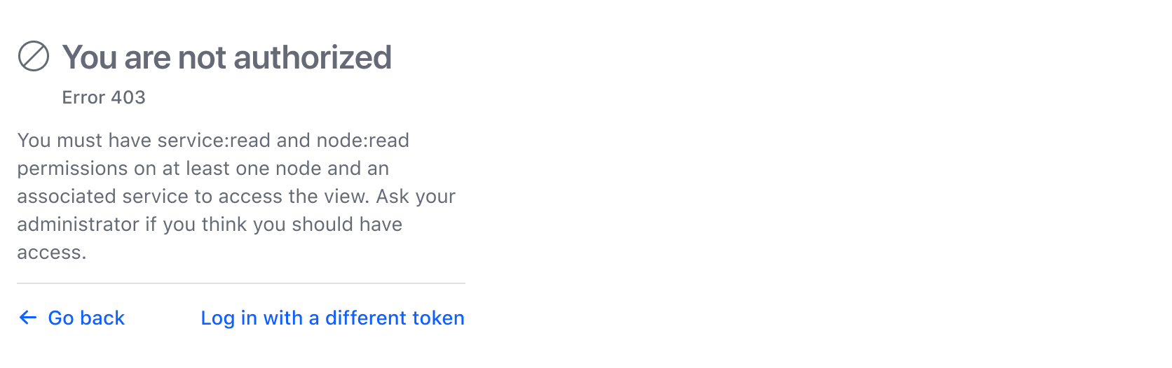
Provide guidance
When a user lands on a page they can't access, indicate why it's unavailable and provide guidance so the user can fix the error. Consider displaying a call to action so the user doesn't feel stuck.
Conditional availability
When other steps must be taken to enable a feature or function, provide context in place of that feature so users can enable it.
In this example, the button is disabled without context, leaving the user confused and unaware of the steps to enable the feature.

Disabled elements lack interactive states, preventing users from hovering, focusing, or clicking. For users with assistive technology, e.g., a screen reader, disabled elements (including their text) are almost entirely ignored.
Instead, we recommended replacing the disabled element with contextual guidance to help users understand why this feature isn't available, and providing them with clear steps to enable it.
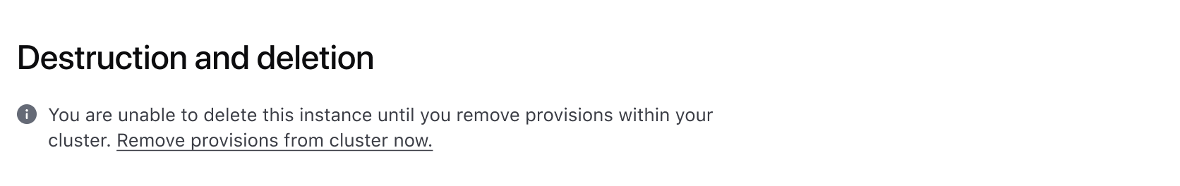
If possible, provide CTAs directly to the place where users can take immediate action.
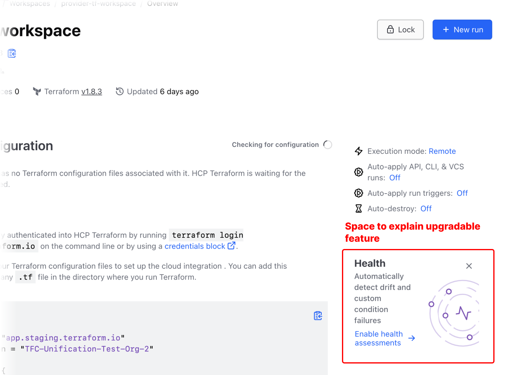
Upgrading
When upgradable features are available and a user has the necessary permissions, highlighting a path to upgrade provides a graceful marketing opportunity. However, be mindful not to overdo it and make the user feel overly advertised to.
There are two ways to showcase an upgradable feature:
- Feature spotlight
- Interrupting an action
Feature spotlight
When the page has space to showcase an upgradable feature, use it to explain how that feature can be a net positive to the user upon upgrading, and provide a CTA as a path forward.
In this example, "Terraform Health" is an upgradable feature and is contextually relevant in the workspace. The UI has space to entice the user by explaining a bit of what this service can do for them.
Interrupting an action
In this example, a user is about to perform an action and notices something new within the list of options.
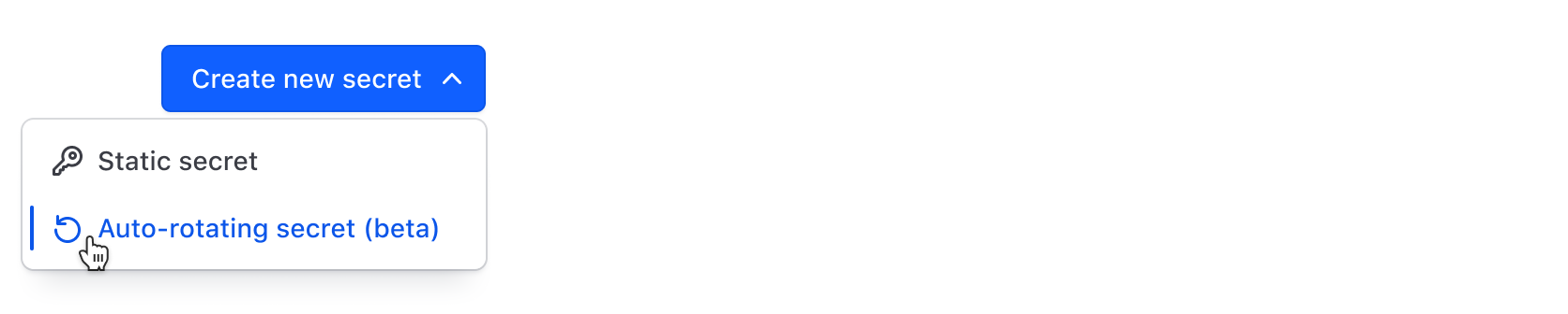
Enticed, they click it to use this feature, however, they are not enrolled in this tier and are interrupted by a modal explaining this feature a little more.
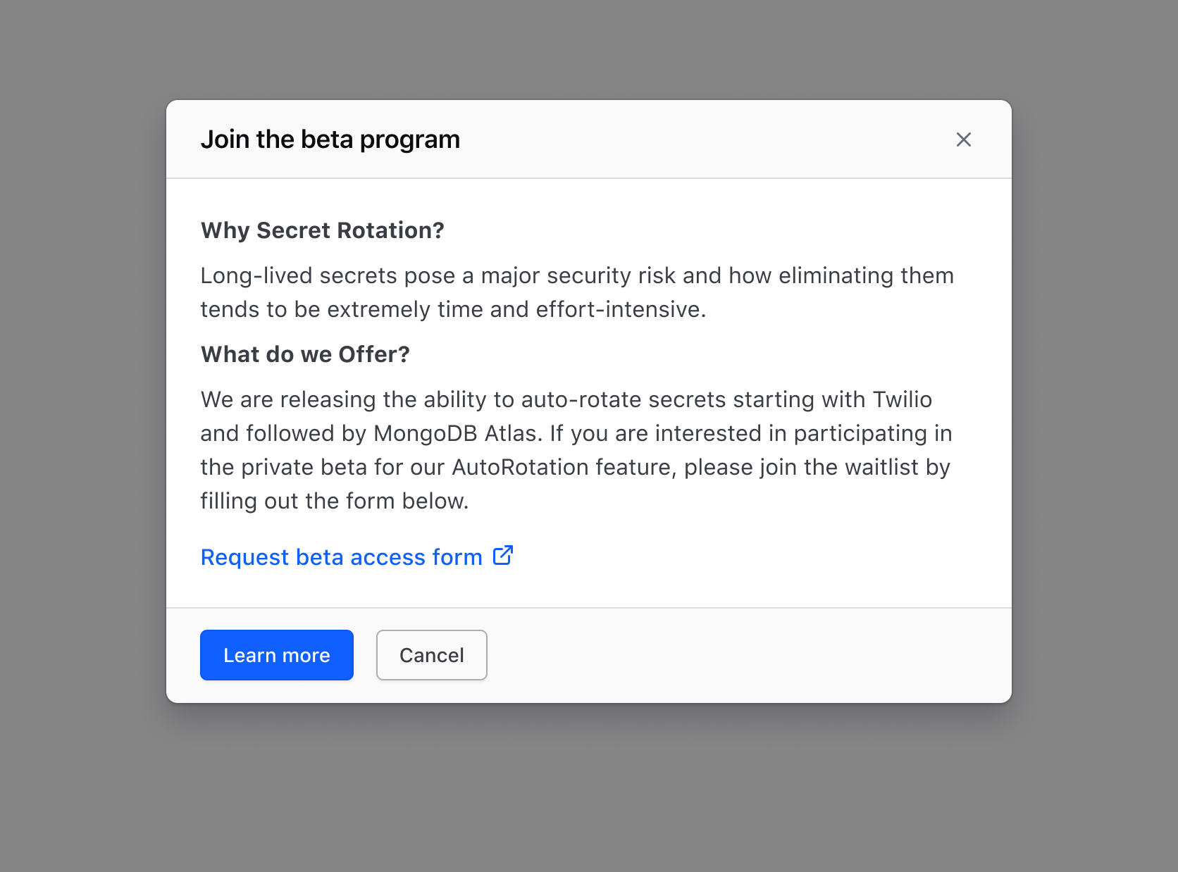
Interrupting the action with a modal helps a user understand more without fully committing, and if more details are necessary they can be directed to an informational page.
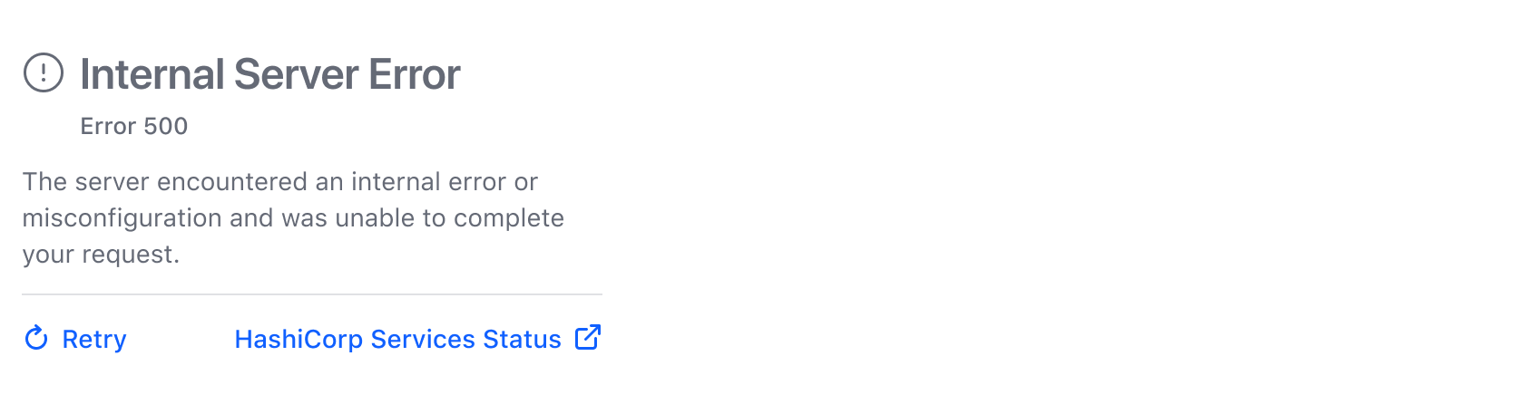
Service outage
In instances where outages may occur, provide a clear message to users on what they can do and add a link to our status page.
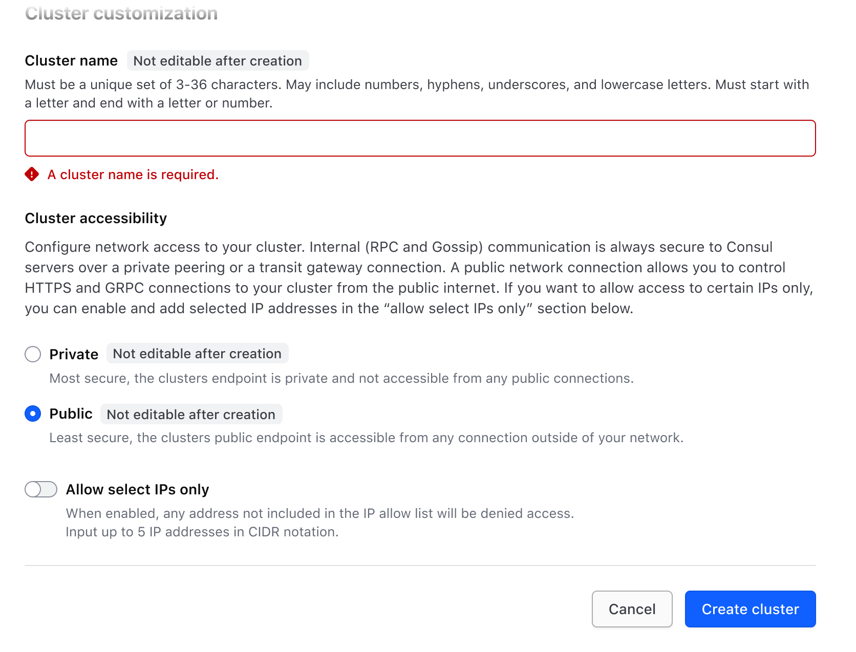
Incomplete flow
In a form, always enable the submit button. When buttons are disabled, users are often left confused and frustrated because they can't move forward. Instead, show users what errors occurred so they can fix them and proceed.
If a user clicks a form submit button but has failed to enter a value in a required field, display an error informing them how to fix the issue.
Learn more about form validation patterns.
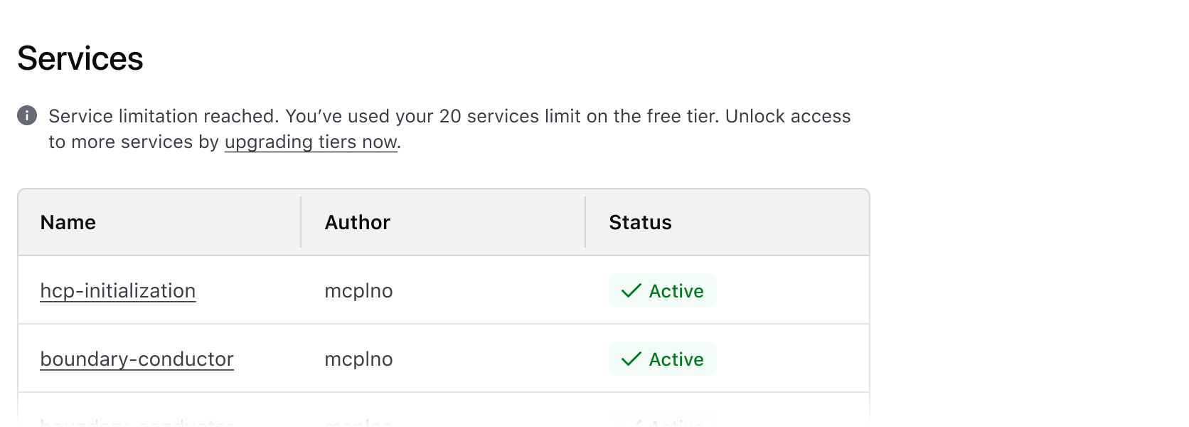
Quota limitation
When the quota has been reached, hide the action allowing the user to create more objects. If they can opt to increase the quota, replace the original action with an action permitting them to do so. If the user cannot increase the quota, e.g., they don't have permission, direct them to a form.
Once the quota has been reached, the "Create" action is hidden, and an Alert is displayed, indicating why new objects can no longer be created.
The disabled attribute is only valid for these HTML elements, referred to as form controls:
<button><fieldset><optgroup><option><select><textarea><input>
From an accessibility perspective, however, using the disabled attribute on a form control can cause issues. This attribute makes the control inaccessible to assistive technology users, essentially making it seem like the element doesn't exist on the webpage.
To make a field non-editable, consider making it readonly vs. setting it as disabled. This will allow all users to access the information while preventing them from interacting with it.
Disabling a link isn't actually possible as a link is not a form control. To simulate a disabled link though, you can use conditionals in Ember to display it as plain text until it is "enabled".
Applicable WCAG Success Criteria
Consult the following Web Content Accessibility Guidelines (WCAG) when considering using the disabled attribute:
-
1.3.1
Info and Relationships (Level A):
Information, structure, and relationships conveyed through presentation can be programmatically determined or are available in text. -
1.3.2
Meaningful Sequence (Level A):
When the sequence in which content is presented affects its meaning, a correct reading sequence can be programmatically determined. -
2.1.1
Keyboard (Level A):
All functionality of the content is operable through a keyboard interface. -
2.4.3
Focus Order (Level A):
If a Web page can be navigated sequentially and the navigation sequences affect meaning or operation, focusable components receive focus in an order that preserves meaning and operability. -
2.4.7
Focus Visible (Level AA):
Any keyboard operable user interface has a mode of operation where the keyboard focus indicator is visible. -
2.5.8
Target Size Minimum (Level AA):
The size of the target for pointer inputs is at least 24 by 24 CSS pixels, with a few exceptions. -
3.2.1
On Focus (Level A):
When any user interface component receives focus, it does not initiate a change of context. -
3.2.2
On Input (Level A):
Changing the setting of any user interface component does not automatically cause a change of context unless the user has been advised of the behavior before using the component. -
3.3.1
Error Identification (Level A):
If an input error is automatically detected, the item that is in error is identified and the error is described to the user in text. -
3.3.2
Labels or Instructions (Level A):
Labels or instructions are provided when content requires user input. -
3.3.3
Error Suggestion (Level AA):
If an input error is automatically detected and suggestions for correction are known, then the suggestions are provided to the user, unless it would jeopardize the security or purpose of the content. -
3.3.4
Error Prevention (Legal, Financial, Data) (Level AA):
For Web pages that cause legal commitments or financial transactions for the user to occur, that modify or delete user-controllable data in data storage systems, or that submit user test responses, at least one of the following is true: submissions are reversible, data is checked and user is provided an opportunity to correct them, a mechanism is available for reviewing, confirming and correcting the information before finalizing the submission. -
4.1.2
Name, Role, Value (Level A):
For all user interface components, the name and role can be programmatically determined; states, properties, and values that can be set by the user can be programmatically set; and notification of changes to these items is available to user agents, including assistive technologies.
Related articles
Further reading on why using disabled elements are the least preferable interaction option.